 You can take many courses on how to use PowerPoint from a technical standpoint, but when it is used effectively, it can add tremendously to our presentations. Here are ten secrets based on years of experience in developing and using presentation slides that will help you move from being technically proficient to using PowerPoint effectively.
 1. Use the Outline View first
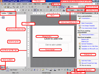
The most important part of any presentation is the content, not the graphical appeal. That is why you should develop your presentation with the content first, before deciding on the look (colours, graphics, etc.) The best way to do this is to use the Outline view. This view is accessed by clicking on the View menu and selecting the Outline command or by clicking on the Outline tool button at the bottom left of the screen (the one with all the lines). This view only shows the text of each slide. You use the Tab key to move to a lower level within a slide or the Shift-Tab key to move to a higher level in the slide. By using the Outline View first, you ensure that the content of your presentation is solid before you concern yourself with the visual elements.
2. Use Contrasting Colours
If you want your audience to be able to see what you have on the slide, there needs to be a lot of contrast between the text colour and the background colour. I suggest a dark background with light text – I usually use a medium to dark blue background and white or yellow letters. Some prefer a light background and dark letters, which will also work well - which you choose will depend on personal preference. Don’t think that just because the text looks fine on your computer screen that it will look fine when projected. Most projectors make colours duller than they appear on a screen, and you should check how your colours look when projected to make sure there is still enough contrast.
3. Use a big enough font
When deciding what font size to use in your presentation, make sure it is big enough so that the audience can read it. I usually find that any font size less than 24 point is too small to be reasonably read in most presentation situations. I would prefer to see most text at a 28 or 32 point size, with titles being 36 to 44 point size. The only reason I would use a font less than 24 point is when adding explanatory text to a graph or diagram, where you could use a 20 point font size. If you are given a small screen in a big room, your font will look smaller because the image will not be as big as it should be. In this case, see if you can get a larger screen, use a wall instead of a screen to project on, move the chairs closer to the screen or remove the last few rows of chairs.
4. Stop the moving text
When text comes on the screen, we want the audience to read the text, then focus back on the presenter to hear the message. If the text moves onto the screen in any way – such as flying in, spiral or zooming – it makes it harder for the audience members to read since they have to wait until the text has stopped before they can read it. This makes the presenter wait longer between each point and makes the audience members focus more on the movement than on what is being said. I suggest the use of the "Appear" effect, which just makes the text appear and is the easiest for the audience to read.
5. Turn the pointer off
During a presentation, it is very annoying to have the pointer (the little arrow) come on the screen while the presenter is speaking. It causes movement on the screen and draws the audience attention from the presenter to the screen. The pointer comes on when the mouse is moved during the presentation. To prevent this from happening, after the Slide Show view has started, press the Ctrl-H key combination. This prevents mouse movement from showing the pointer. If you need to bring the pointer on screen after this, press the A key. If the pointer does appear during your presentation, resist the urge to press the Escape key – if you do, it will stop the presentation and drop you back into the program. Press the A key or Ctrl-H to make the pointer disappear.
6. Use the PowerPoint Viewer to Present
There is a free program (downloaded from the Microsoft web site) called the PowerPoint viewer which can be a great tool for presenters. It was developed so that if someone did not have the PowerPoint program, they would still be able to view and print the slides in your presentation. It is much smaller than the full program because it does not have the ability to edit the slides, only view or print. The small size of the program is important because it is less prone to crashing than is the full program. The viewer also contains a feature that is absent in the full program – the use of list files. You can set up a list of presentation files that you want run one after the other, and the viewer will automatically load the next file in the list without you having to do anything. This can be very valuable when you have multiple presenters each with their own file, or when the presentation is made up of a number of segments.
7. Have Slides at the End of Your Presentation
The last slide you speak to should not be the last slide in your presentation file. You should have three identical copies of your last speaking slide so that if you accidentally advance one too many times at the end of your presentation, your audience never knows because you don’t drop into the program, the slide looks like it has not changed. After these slides, you should include some slides that answer questions that you expect to be asked. These slides will be useful during Q&A sessions after the presentation. The final slide should be a blank slide so that if you go through all the other slides, you have a final backup from dropping into the program.
8. Be able to Jump to Any Slide
PowerPoint has a feature that allows you to be able to move quickly and seamlessly to any slide in your presentation. To do so, you need to know the slide numbers. The easiest way to print a list of the slide numbers and associated slide titles is to go to the Outline View and collapse the details for each slide (there is a button on the left side of the screen in this view that will do this). Then print the view. To jump to any slide, just enter the slide number on the keyboard and press the Enter key. This will move you directly to that slide. This technique is very useful for moving to a prepared Q&A slide or for skipping parts of your presentation if time becomes an issue.
9. Blank the screen
Sometimes we want the image on the screen to disappear so that the audience is focused solely on the presenter. There are two ways to do this. The first is if you want to blank the screen with a black image, similar to shutting the projector off (we used to do this all the time with overhead projectors by just shutting the projector off). Just press the B key on the keyboard and the image is replaced with a black image. Press the B key again and the image is restored. If you want to use a white image instead of a black image, press the W key each time.
10. Draw on the screen during a presentation
Sometimes it can be valuable to be able to draw on the screen during your presentation to illustrate a particular point or item. This can be done in the following way. Press the Ctrl-P key combination to display a pen on the screen. Then, using the left mouse button, draw on the slide as you wish. To erase what you have drawn, press the E key. To hide pen, press the A key or the Ctrl-H key combination.
When you employ these secrets to use PowerPoint effectively, you will greatly enhance your audience’s understanding of your message and help to make your presentation the best it can


0 comments:
Post a Comment
Thanks for commenting... ;)